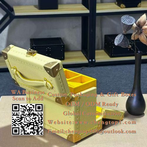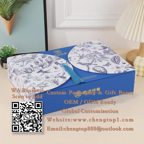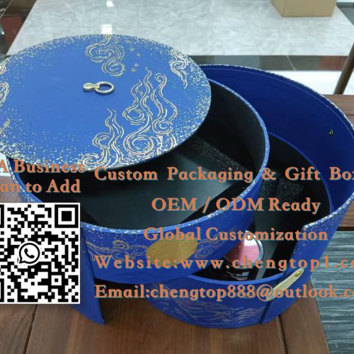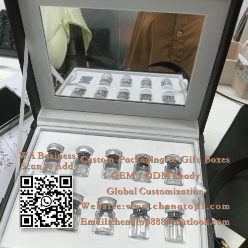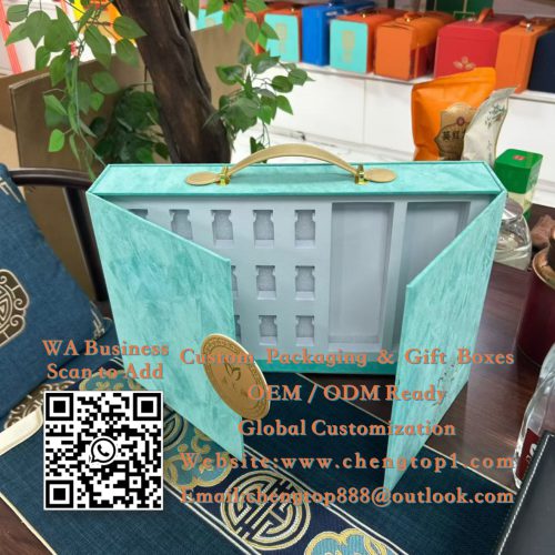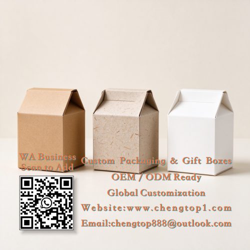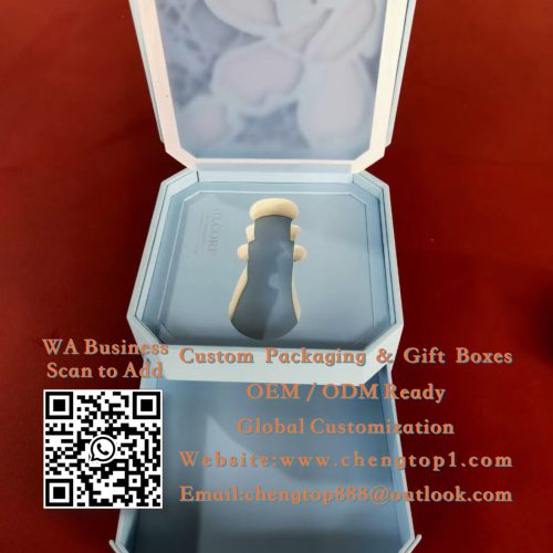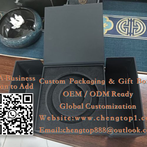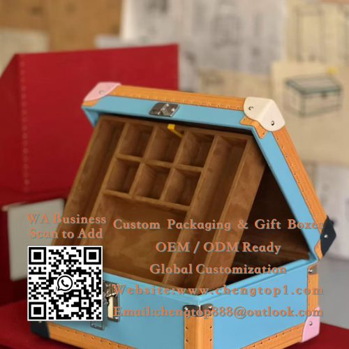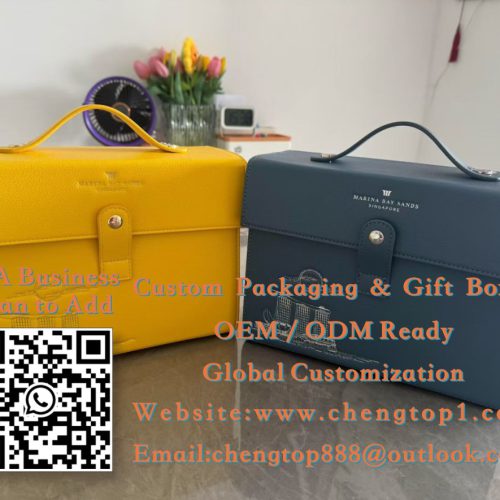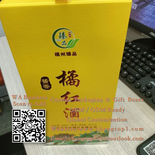
How do you match the box shape to the contents? Tall, slender boxes suit perfumes or liquor bottles, while wide, flat boxes suit cosmetics or food. The box shape must align with the contents first—aesthetics come second. Internal securing mechanisms (inserts) also affect proportions. The workflow is simple: define the contents first, then determine the proportions.
How do you apply common proportions? Aim for a length-to-width ratio close to the Golden Ratio (1:1.618) and balance width against height to convey stability. For two-piece boxes (lid and base), the box height must match the product height; too much headspace looks empty, while too little looks cramped. The ultimate test for proportions is placing the actual product inside to see how it looks.
How do you verify proportions? Print a 1:1 paper mock-up and place the product inside to evaluate the effect. Physical mock-ups are more reliable than digital renderings, and visual perception of proportions varies by channel (e.g., retail shelves vs. e-commerce images). The verification process involves examining the physical mock-up before finalizing the design.
The art of box proportions is essentially about ensuring the box does justice to its contents: length, width, and height define the “character”; the visual center of gravity directs the eye; and paper mock-ups reveal the reality. Get the proportions right, and the box is already halfway to success before a word is spoken.
How do you design the visual center of gravity? Consider the placement of the logo and key visuals on the box face: positioning them higher creates a sense of lightness, while centering them conveys stability. The direction of the viewer’s gaze upon opening (and the logo’s orientation) is also a key design factor. The guiding principle is ensuring the focal point is immediately visible upon opening.
Two boxes may have similar dimensions, yet one looks “right” while the other feels “off”—the difference often lies in the proportions. The relationship between length, width, and height determines the box’s presence on the shelf. This article explains box shape proportions clearly, making the concepts easy for custom-packaging clients to grasp.
Why do proportions matter? They shape visual perception: boxes that are too flat look cheap, those that are too tall look flimsy, and those that are too square look clunky. The right proportions make a box look premium at a glance. Ultimately, proportions define the “first-impression aesthetic.”