Thank You Cards in Multiple Languages: A Printer’s Guide for Cross-Border Brands
An English thank you line rarely fits the same layout in German, and a message that fits German may not work in Japanese type at all. Brands selling into several markets often find this out after the plates are made, when the only fix left is a reprint. Here is how to settle the versions, the type and the packing before the first proof goes out.
Request a Quote
Enter the quantity you need and add to your quote list for pricing inquiries.
Description
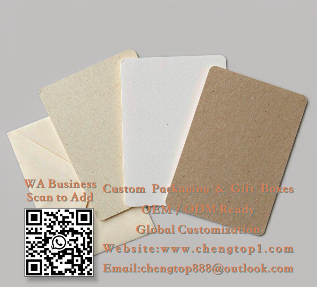
Most multilingual card projects go wrong at the quotation stage, not on press. A one-line greeting becomes three lines in another language, the footer drops below what uncoated stock can hold, and a single card quietly turns into two. The root cause is treating translation as a text swap instead of a layout decision. This guide covers whether to split the run by market, what translation does to type and finishes, and how to keep the versions from being mixed in the carton. Our thank you cards use a common set of sizes, which makes a split far cheaper than it sounds.
One Card With Three Languages, or Three Separate Runs?

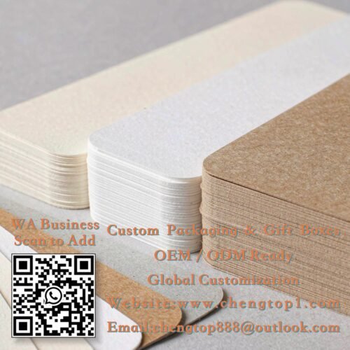
On an A6 card (105 × 148 mm) at 350 gsm, a bilingual message is comfortable; three languages plus a logo and a QR symbol usually is not. German and Russian copy commonly runs 20–35% longer than the English source, and once you allow 8–10 mm of clear margin plus 3 mm bleed, there is no space left to solve the problem by shrinking type. Keep body text at 9–10 pt or larger on uncoated stock, because fine serifs and small reversed-out text tend to fill in. If the message has to carry legal or care information, it does not belong on a thank you card at all — put it on a proper insert and keep the card short.
The alternative is separate versions on one shared dieline and one shared paper lot. Each language gets its own plate and its own 1,000-piece minimum, but the cutting tool, the stock and the packing spec stay identical, so the extra cost is mostly plate and setup rather than a new product. Three versions at 1,000 each usually work out better than 3,000 cards with a cramped three-language layout that nobody reads. Give each version a short code on the order, and approve all of them in the same 3–7 day sampling round. Approving them one at a time is how two markets end up with slightly different paper shades.
- Allow 20–35% more space for German, Russian and French copy than the English source
- Keep body type at 9–10 pt minimum with 8–10 mm clear margins on uncoated stock
- Share one dieline and paper lot across versions; expect a 1,000-piece minimum per language
Type, Characters and Finishes That Survive Translation
Send the final translated text as an outlined PDF, not an editable file with a font attached. CJK glyphs, accented Latin characters and right-to-left scripts are the three common failures: a missing glyph prints as a blank box, and an RTL line set in the wrong order reverses punctuation. Ask for a native-speaker sign-off on the proof, because a spellchecker will not catch a well-formed word used in the wrong register. Where a script needs a font your printer does not hold, supply the licensed font file with the artwork and confirm it may be embedded.
Finishes need the same check. Foil stamping and letterpress tolerate small text poorly — below about 8 pt, fine strokes close up, and a translated line that grew by a third no longer fits the foil area. White ink on a dark board is unforgiving for the same reason. A practical route for long copy is a short printed greeting plus a 12–15 mm QR symbol pointing to a landing page that serves the right language from the browser setting. That keeps the card uncluttered, and a wording change later does not trigger a reprint. Confirm the symbol scans on the actual paper, since a textured kraft stock can drop the contrast enough to fail under shop lighting.
- Outline all fonts and supply licensed files for non-Latin scripts
- Get native-speaker sign-off on the same proof the factory prints from
- Keep foil and letterpress text above 8 pt; move long copy behind a 12–15 mm QR symbol
Version Control From the Press to the Carton
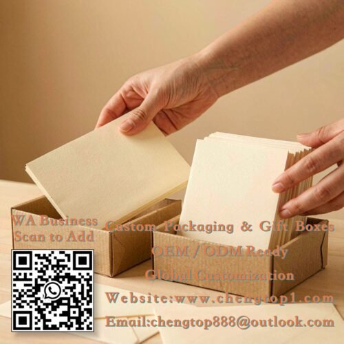
Mixing versions is the most expensive mistake in a multilingual order, and it happens at packing rather than on press. Put the version code on the inner bundle wrap, the outer carton and the packing list, and keep a signed sample of each language for 12 months. If the cards ship with custom paper bags or a custom sticker seal that also carries words, check that those use the same market naming and the same product name. A French card in a carton with an English sticker looks like a mistake to the customer even when nothing is technically wrong.
Plan quantities market by market instead of splitting an even total. A 3,000-piece order rarely needs three equal stacks of 1,000, and an uneven split costs nothing extra as long as it is on the purchase order before production starts. Production runs 10–15 working days after approval, with express at 5–7 days and sea freight at 20–40 days, so a market that launches first should be stated on the order rather than requested after the goods are on a pallet. For a small test in a new country, a single-language 1,000-piece run is a reasonable first step; the shared dieline stays usable when the second language is added later.
- Version code on bundle wrap, outer carton and packing list, plus one signed sample per language
- Match the language and product naming on bags, seals and inserts
- State uneven quantities and launch order on the purchase order, not after production
Ready to Print in More Than One Language?
Send us the language list, the final text for each market, your card size and the quantity per version — we will reply with a layout suggestion, a free artwork check and a quote within 24 hours. Samples take 3–7 days, production 10–15 working days after approval, express 5–7 days and sea freight 20–40 days.