
Designing for the Rainbow: How to Create Hologram Sticker Artwork That Actually Works
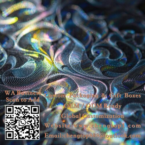
A holographic sticker is the only printed product where part of the design is made of light. That changes the design rules completely: colors shift, backgrounds interfere, and busy artwork gets lost. Here is how to design for the film instead of fighting it.
اطلب عرض أسعار
أدخل الكمية التي تحتاجها وأضفها إلى قائمة عروض الأسعار الخاصة بك للاستفسار عن الأسعار.
الوصف
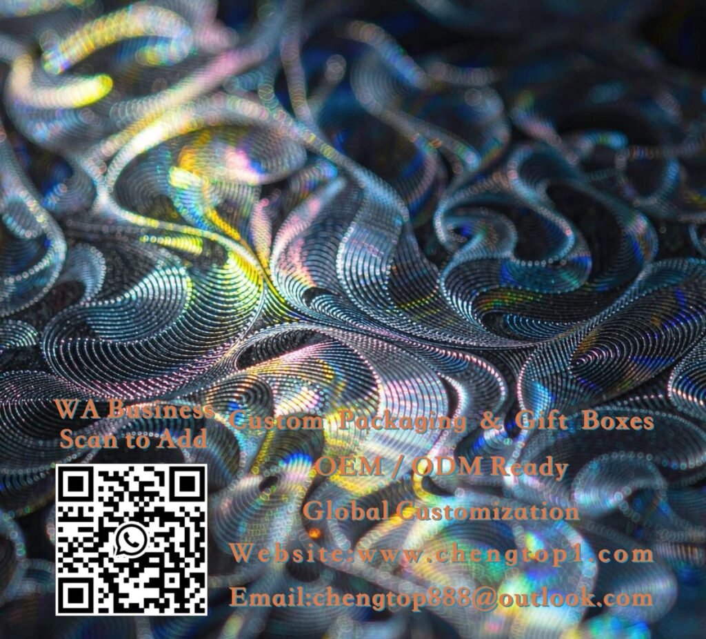
Designers who are used to flat printing often struggle with their first hologram project — the artwork that looked perfect in Photoshop arrives on the film and half of it disappears. The reason is simple: on a holographic security sticker, the background is not a fixed color but a moving spectrum of light. Design well for that, and the result is a sticker no counterfeiter wants to copy. Here are the rules that matter.
Rule One: Contrast Carries the Design, Not Color
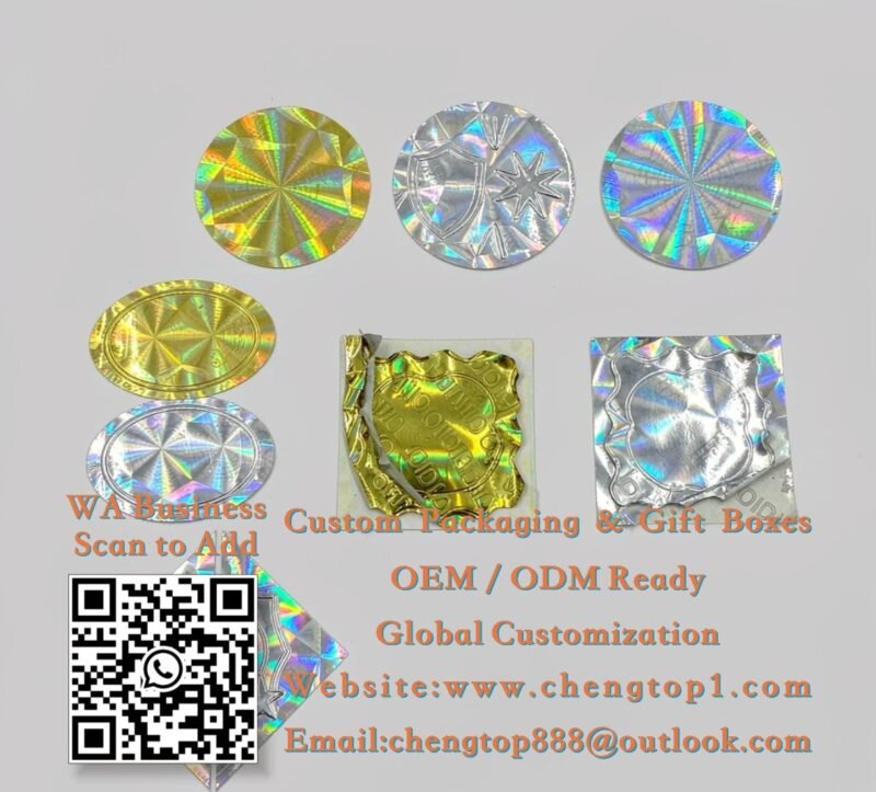
On holographic film, your printed areas sit on top of a shifting rainbow. A printed element can only stay readable if it contrasts strongly with that shimmer — which usually means very dark or very light ink. Deep black, pure white and metallic silver are the reliable choices; mid-tones (grays, soft pastels, light navy) vibrate against the rainbow and lose definition. The most durable classic is a white or black knockout of your logo or monogram over the raw hologram — the rainbow becomes your “background color,” and it changes with every viewing angle, which is precisely the effect that cannot be faked on a home printer. When clients send us artwork for custom holograms, the first thing we test is how the design reads at three angles; if it survives that, it survives the shelf.
- Reliable inks: black, white, metallic silver, metallic gold
- Avoid: mid-tone grays and pastels — they drown in the rainbow
- Classic formula: knockout logo over raw hologram background
Simple Shapes Beat Fine Detail

Here is the counterintuitive part: the film itself is full of microscopic detail — that is what makes it impossible to photocopy. But the artwork you print on top should be the opposite: bold shapes, thick lines, generous spacing. Thin type and delicate ornaments fight the shimmer and turn to noise at 20 mm. A good rule: if an element is not readable from arm’s length at a glance, simplify it. Fine texture belongs in the security pattern (the film provides it for free); bold identity belongs in your print. This is why seals built around a monogram, an icon or a simple border ring consistently outperform miniature versions of a full label design.
- Minimum readable detail: think 1 mm strokes at final size
- One hero element — logo, icon or monogram — is enough
- Let the film’s own micro-pattern supply the “busy” security layer
Match the Film to the Package Background
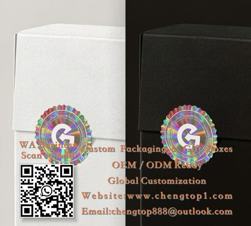
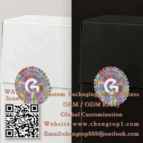
Holographic film does not just show its own light — it borrows from whatever sits behind it. The identical rainbow seal looks crisp and luminous on a white box and darker, more metallic and moody on black. Transparent film goes further: it is nearly invisible until tilted, showing a whisper of rainbow over the product itself — the most subtle option, and the favorite for bottles and cosmetics where you do not want to hide the label underneath. The practical advice: always test the film choice against your real packaging color, not a white background. A silver hologram that pops on kraft may vanish on a silver metal tin; a rainbow that sings on black may look washed out on cream. We provide film samples for exactly this test before you commit to a full run.
- Rainbow film: maximum visibility, playful and loud
- Silver film: premium, technical, consistent
- Transparent film: subtle, lets the product show through — ideal on bottles
Design the Anti-Copy Layer, Not Just the Pretty Layer

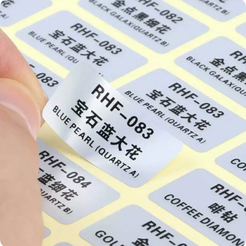
The final principle: remember why the sticker exists. A hologram deters copying because its diffraction pattern cannot be reproduced by scanners or printers — so your design should expose the film, not cover it. Designs that flood the whole sticker with opaque ink waste the anti-counterfeit power they paid for. Leave a visible band or background of raw hologram around your logo, and consider adding elements a counterfeiter must replicate twice: a fine border ring, an outlined emblem, or numbering across the batch. Combine that with the placement principles from our tamper-evident guide and the sticker does both jobs — beauty and protection — in one press pass. For full guidance on combining holograms with ordinary printed labels, see our stickers & labels range.
- Leave raw hologram visible — that shimmer IS the security
- Border rings and outlined elements are hard to fake and cheap to print
- Serial numbering adds traceability on top of visual security
Free Artwork Review
Send your design or just your logo — we will check it for hologram compatibility, suggest the right film, and quote within 24 hours.