One Card Doesn’t Fit All: Thank You Card Ideas for Jewelry, Candles, Apparel and Beauty Brands
A jewelry buyer and a candle buyer respond to different details. The card that feels precious in a ring box feels wasteful next to a soy candle. Here is how four common product categories style their thank you cards — and why.
اطلب عرض أسعار
أدخل الكمية التي تحتاجها وأضفها إلى قائمة عروض الأسعار الخاصة بك للاستفسار عن الأسعار.
الوصف
By the time a brand orders its third run of thank you cards, a pattern emerges: the brands that get the most from the card are the ones that matched it to their product category, not to a generic template. Size, paper, edge treatment and tone all shift with what you sell. Here is the breakdown for four of the categories we print for most.
Jewelry: Small, Precious, and Finished Like the Product

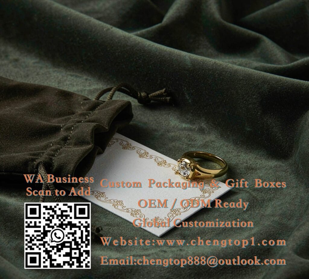
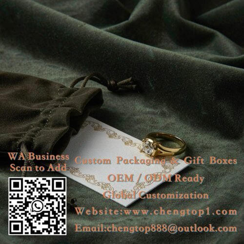
Jewelry packaging is small, so the card must be too: business-card size or smaller, so it never crowds the box. What jewelry cards trade in is finishing — gold or colored edge painting, a delicate border, letterpress texture, thick (400+ gsm) stock. The card competes with the product for “preciousness,” and winning that comparison is the point: the buyer should feel the brand sweats details at every scale. Tone of voice: brief, warm, slightly formal — this is a category where two sentences are plenty. This is also the category where pairing the card with a small holographic seal on the box adds both security and a touch of ceremony.
- Size: business card (90×50 mm) or mini square
- Finishes: edge painting, letterpress, foil — one is enough
- MOQ: from 500 pieces
Candles & Home Fragrance: Warm, Textured, Story-Driven
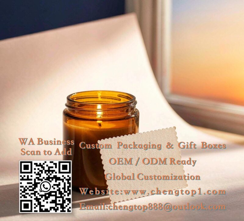
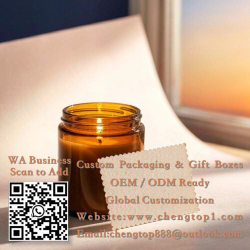
Candle buyers purchase mood, and the card should smell (figuratively) of the same mood. Larger than jewelry cards — A6 or a generous mini card — on textured uncoated stock in cream, kraft or muted tones, often with charming die-cut edges like the scallop above. This is the category where a short brand story works: two or three lines about how the candle was made, or how to make it burn beautifully, turn the card into useful content rather than an ad. Care instructions (“trim the wick, first burn to the edge”) are the single most appreciated card insert in this category — they reduce bad reviews caused by user error, which makes the card a support tool as much as a thank-you.
- Size: A6 (105×148 mm) or custom mini card
- Stock: textured uncoated, kraft or cream tones
- Content tip: include burn care instructions — customers genuinely use them
Apparel: The Care-Card That Doubles as a Brand Touch
Clothing brands face a practical reality: garments need washing instructions, and a printed card is the classiest place to put them. The typical apparel card is A6, one side carrying a short thank-you and brand mark, the other carrying care guidance and a care-words glossary — which guarantees the card is kept, not discarded, because throwing it away means losing the instructions. Materials follow the garment’s personality: crisp white stock for minimalist fashion brands, kraft or earthy tones for heritage and outdoor brands. Tie the card to the garment with twine through a corner hole, and it becomes part of the presentation — a technique we covered in our guide to card presentation, and one apparel brands use more than any other category.
- Size: A6, often with a corner punch hole for tying
- Content: care instructions on the back = the card gets kept
- Style match: follow the garment’s personality, not the box’s
Beauty & Skincare: Soft Colors, Rituals, and Reorder Nudges
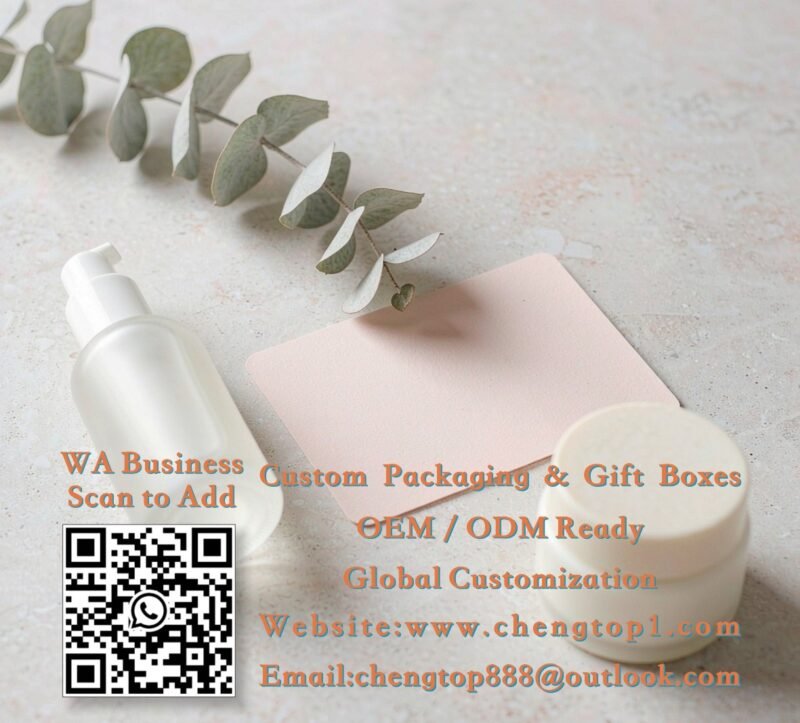
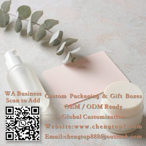
Skincare and cosmetics buyers are the most design-literate customers in retail, and the card must pass their aesthetic bar before its words get read. Soft rounded corners, muted color fields (blush, sage, terracotta), generous white space and a single elegant typeface do the work. Content-wise, beauty cards have a natural job: the usage ritual (“apply to damp skin, morning and night”) plus a reorder nudge — this is the one category where a discount code for the same product performs best, because skincare is consumable by nature. Rounded corners and colored stock cost little at MOQ and lift the perceived value of the entire unboxing.
- Size: A6 or square, rounded corners strongly recommended
- Content: usage ritual + reorder code — consumable products convert
- Style: muted color fields, minimal type, no busy borders
Find Your Category’s Card
Tell us what you sell — we will suggest the right size, stock and content for your category, with a quote within 24 hours.