

Where Should Your Logo Go on a Paper Bag? A Practical Design Placement Guide
A great logo in the wrong place disappears; a simple mark in the right place becomes the brand. Logo size, position and the colors you give the handles and base decide whether your bag gets noticed from across the street.
Solicitar un presupuesto
Introduce la cantidad que necesitas y añádela a tu lista de presupuestos para solicitar precios.
Descripción
When brands send artwork for custom paper bags, the file is usually fine — the layout is what needs help. Bag design follows a few placement rules that come from how bags are carried, photographed and seen. Apply them and even a simple logo looks like it belongs to a bigger brand. Here is the guide we walk clients through at artwork stage.
Position: Eye Level Wins, Center Is the Safe Bet

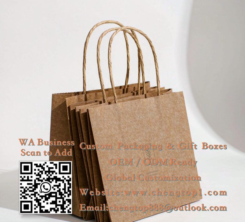
A carried bag is seen in two states: hanging from a shoulder at roughly chest height, and sitting on a table or counter. In both states, the center of the front panel lands in the natural line of sight — which is why centered placement is the timeless default and the safest choice for a first order. Positioning the logo high (just under the handle line) gives a fashion-forward, editorial feel; anchoring it at the bottom edge is bolder and rarer, and works when the mark is small and the empty space above does the talking. What almost never works: logos close to the side gussets or creases, where the fold distorts them. The two bags below show the contrast — same round mark, different positions, two entirely different brand personalities.
- Centered: safe, classic, works for every industry
- High placement: editorial, fashion-forward
- Avoid: within 30 mm of folds, gussets and handle patches
Size: Small Enough to Breathe, Big Enough to Read

The most common artwork mistake is a logo sized for a business card, scaled up until it dominates the bag. On a shopping bag, restraint reads as confidence: a mark occupying roughly one-quarter to one-third of the panel width is the professional zone, with empty space around it doing the styling. Below that, keep the logo readable at five meters — beyond that distance, details vanish and only shape and contrast survive. Contrast matters more than size here: on a black bag, a white or metallic mark carries further than a larger logo in a mid-tone; on natural kraft, both dark brown and white hold well. One mark, well placed, beats three elements competing for attention every time. And if your logo is text-based, check with us that it stays legible at bag scale — this is exactly what our free artwork review is for.
- Logo width: 25–33% of the panel — no bigger on a first order
- Test readability at 5 meters; contrast beats size
- Dark bags want light marks; kraft accepts both dark and white
Details: Handles, Base and Interior Are Part of the Design

The fastest way to make a bag look designed is not more printing — it is color in the right places. Handle color is the easiest upgrade: twisted paper handles in a brand accent color (like the terracotta above) coordinate the whole bag for almost no added cost. A contrasting base — a colored band along the bottom edge — grounds the bag visually and echoes nicely when the bag is seen edge-on in a stack. Flat tape handles in a matching brand color do the same job for a sleeker look. For higher budgets, a printed interior (visible when the bag opens) is the classic luxury surprise. These details compound: a simple centered logo plus colored handles plus a contrast base looks fully art-directed, at a fraction of the cost of all-over printing — and pairs beautifully with a matching branded sticker closing the bag or a thank you card inside.
- Accent-colored handles: biggest design win per dollar
- Contrast base band: grounds the design, looks good stacked
- Printed interior: the classic luxury move, for higher budgets
Free Layout Review
Send your logo — we will propose placement, size and accent colors on a digital mockup of your bag, free, with quotes within 24 hours.